Project
Fley Design
The Idea
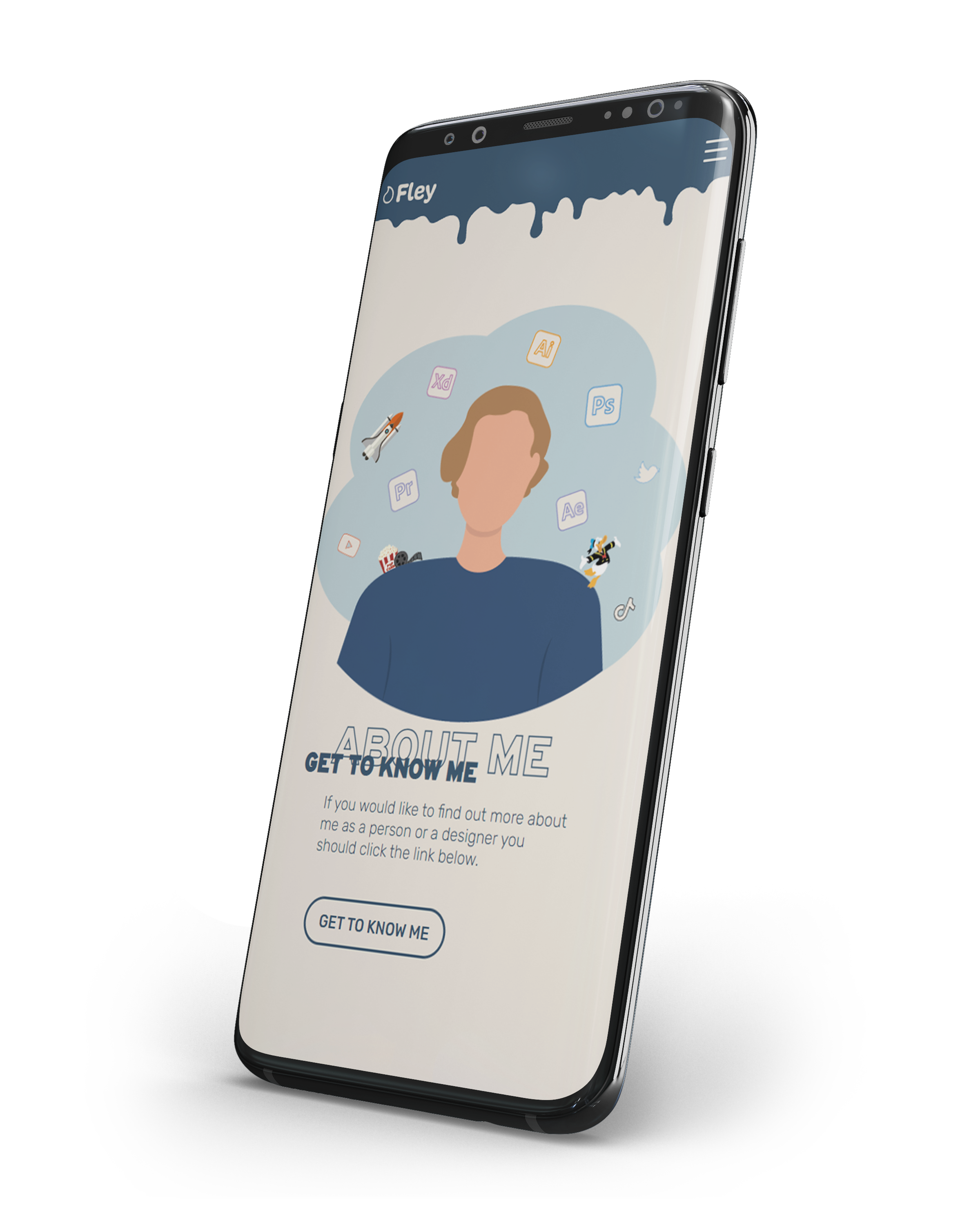
The goal was to create a full brand with a website to use as my own portoflio and as a way for people to get in touch with me.
Thoughts
The brand should convey a playful, creative but still professional look and it should have a memorable and simple Logo with a story behind it.
Choosing 1
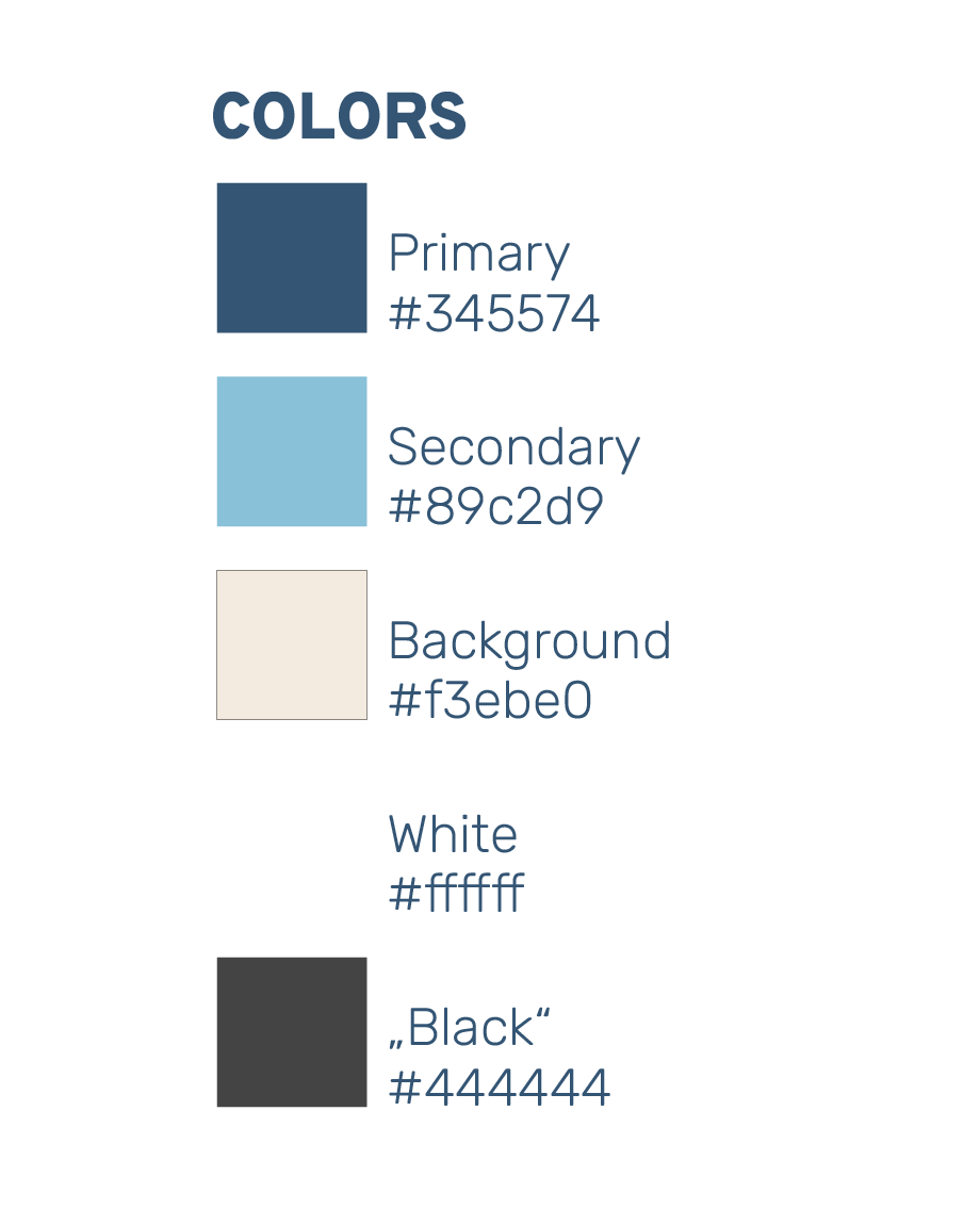
As a next step were these colors selected to match the previously decided values. A strong blue as a primary color with an pleasant cream like color as a secondary and a light blue for accents.
Choosing 2
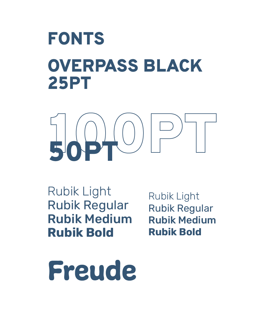
Fonts are also an important part of a digital Identity. Overpass for heavy and eyecatching Titles and Rubik as a clear and easy to read Text font. For the Logo I chose Freude to add a bit of playfulness.
The Logo
In the following pictures you can see the process of creating the final Logo for the Brand. The drop resembles a tip of a brush and can also be seen as a drop of color or water. Color for creativity and water for the creation of things(life).
Explained
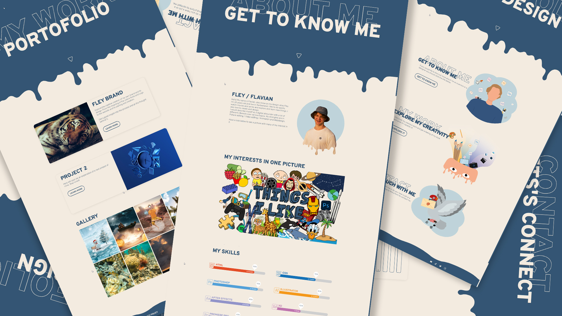
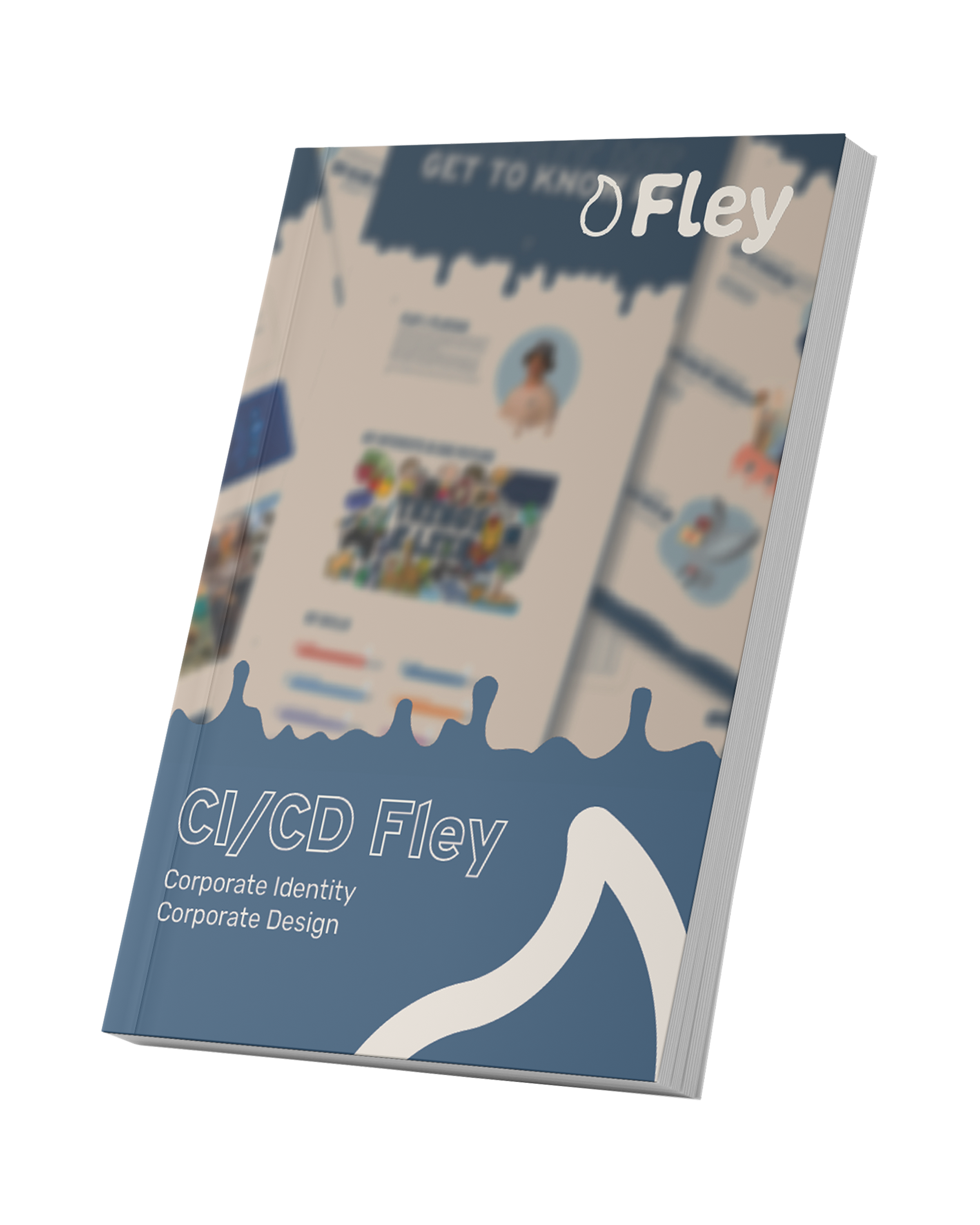
If you'd like to get a more detailed look about the brand, you can download the full breakdown PDF and read trough it. Or you can just have a look around the finished Website.
Download See Result